serif mode
Client:
Sample team
Service:
Digital branding
Art direction
Website
Year
2023
Sample team
Service:
Digital branding
Art direction
Website
Year
2023
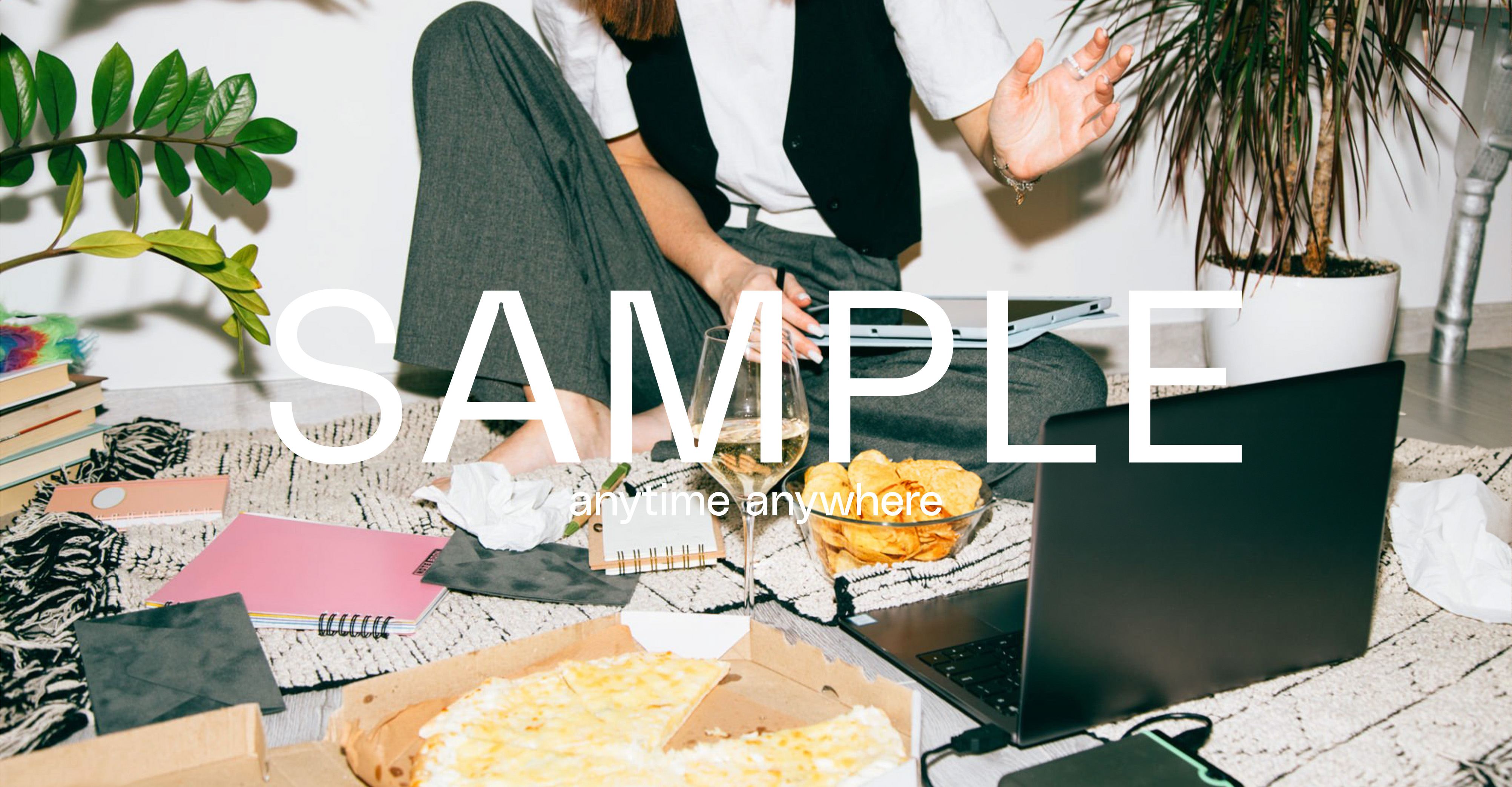
“Sample” is a bimonthly local Literature and Art magazine based in Hong Kong. For some reason is not allowed to produce a physical magazine for a while. So ther’re planning to shift the existing and upcoming context to the online platform, such as website and social media. The new branding design will work with the new strategy and assist the future growing.
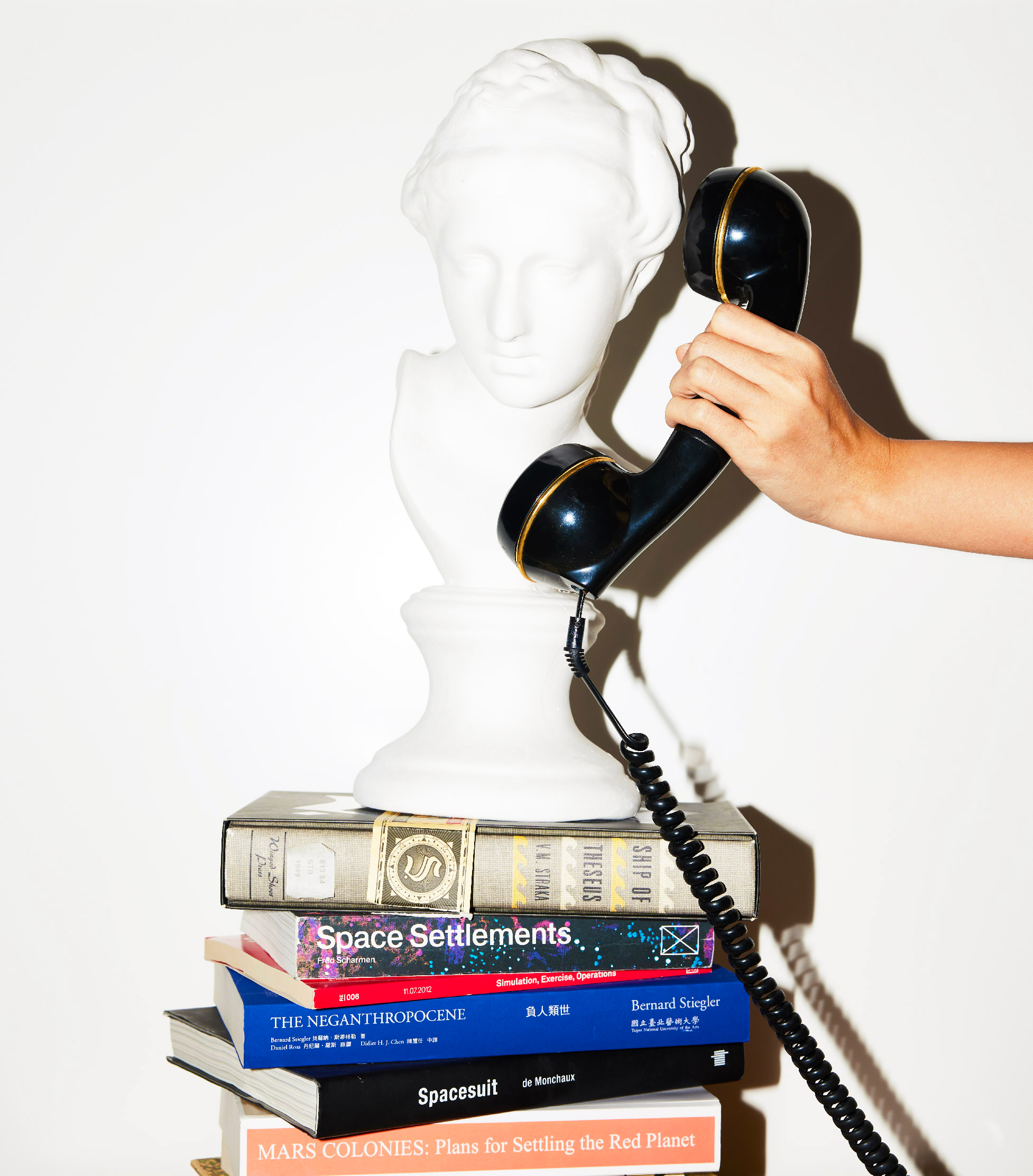

photo:franc.is.wong
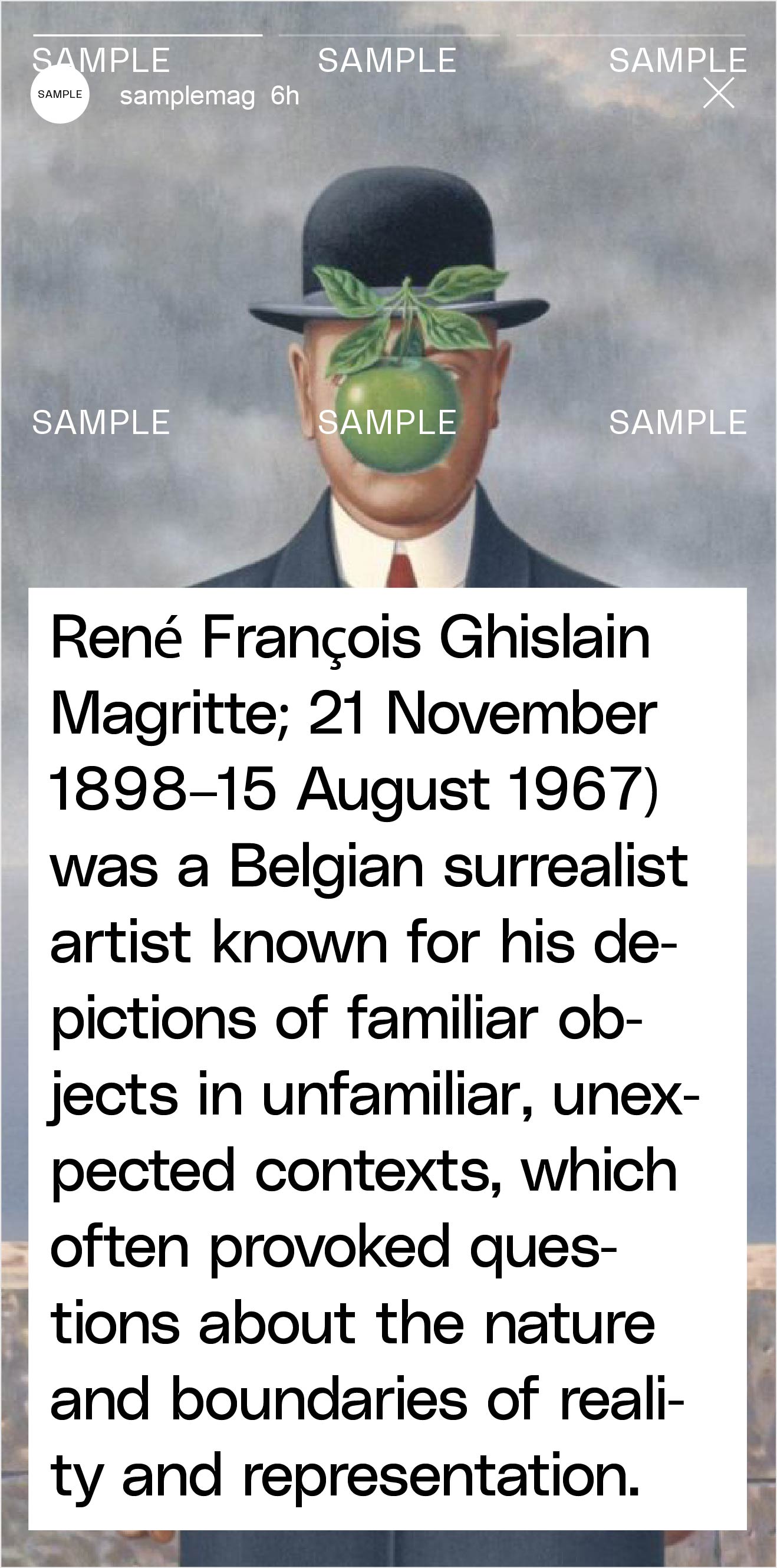
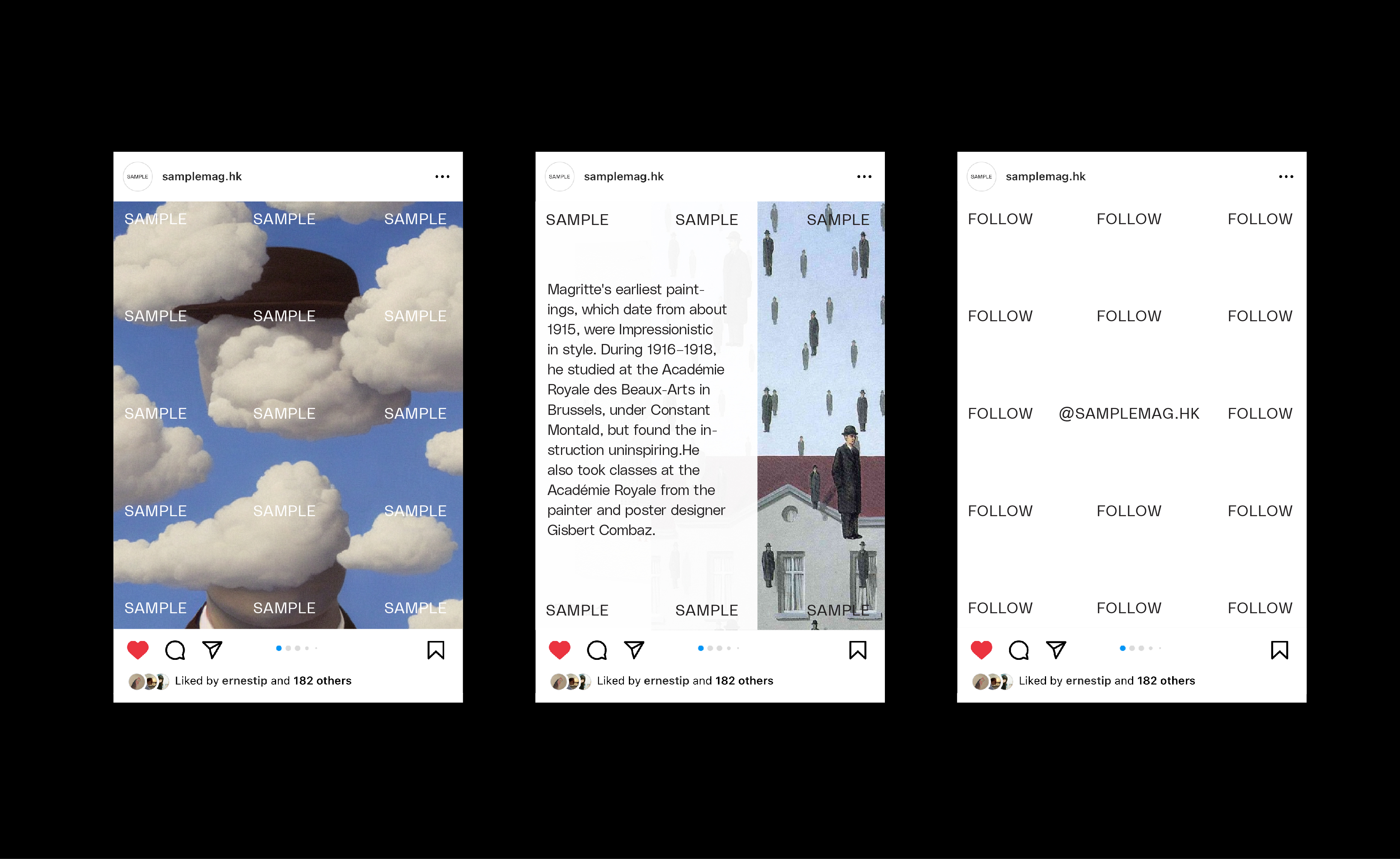
The new branding strategy advocates people to read the full article(seasonal) on the website and some short articles on social media with their own devices anytime and anywhere.
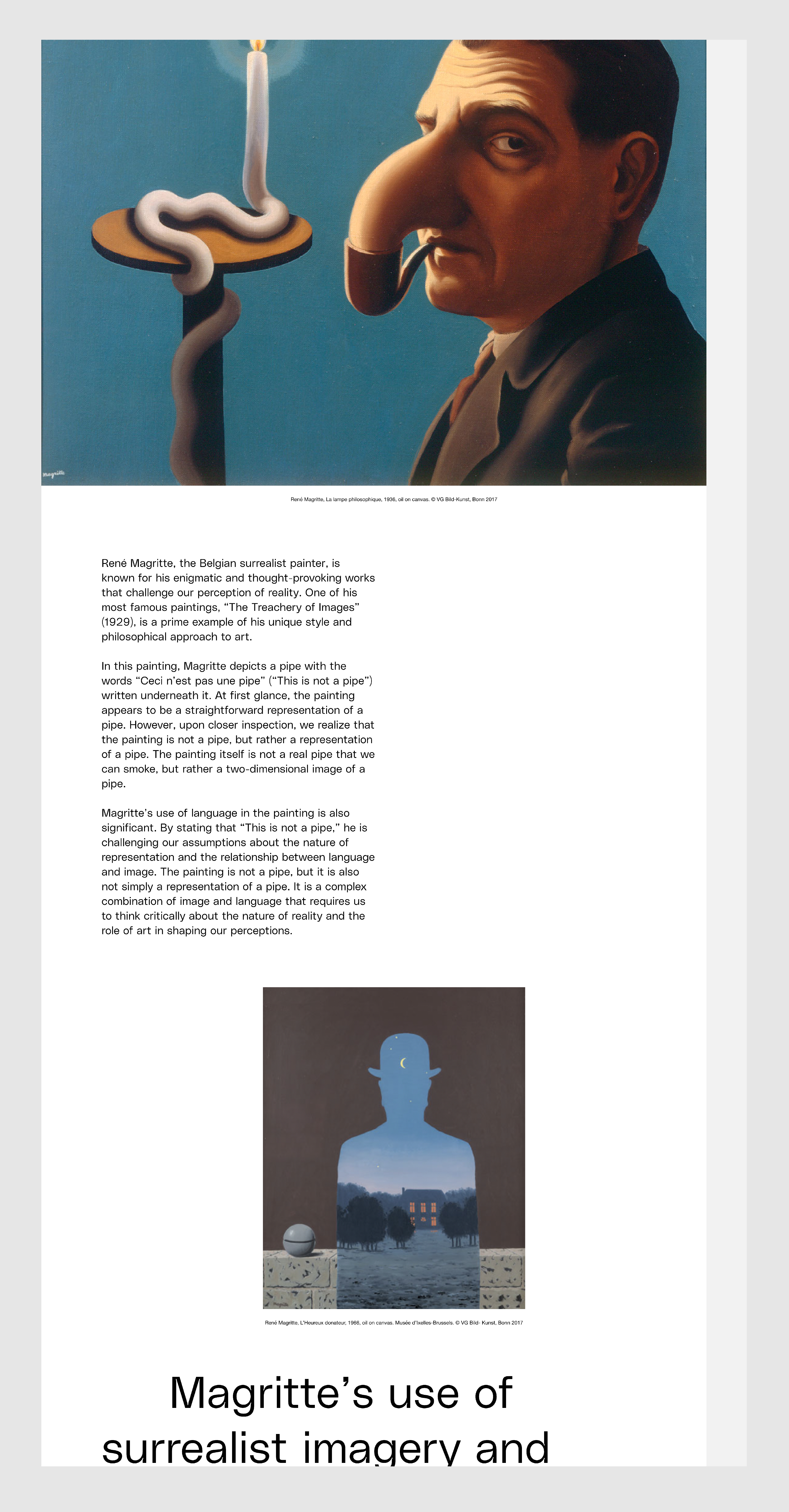
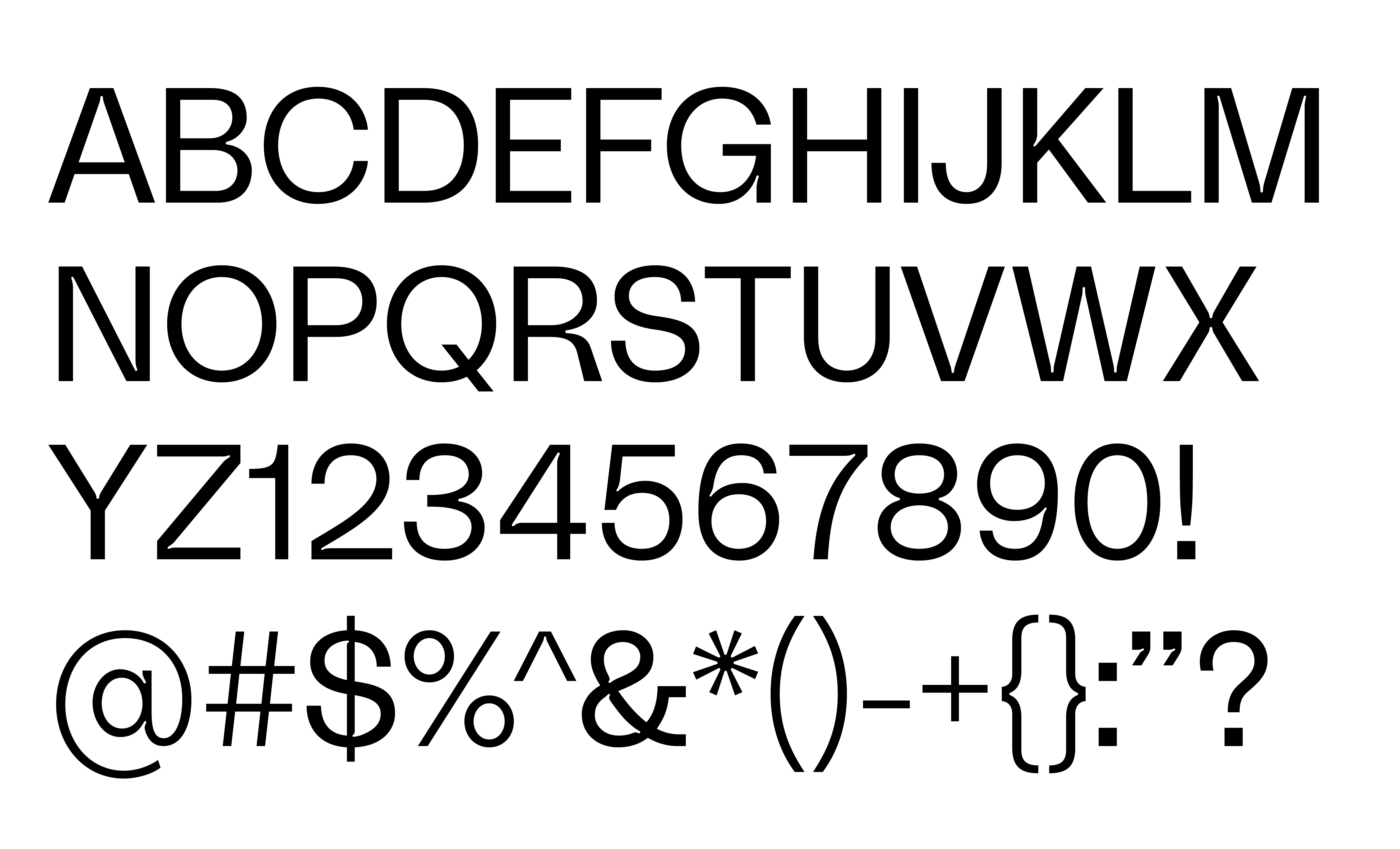
The “Polysan” by @gradient was chosen as the main typeface for the project, because the ink trap feature is able to connect with the sense of physical magazine printing technology which is associated with the “Sample” past. As for the logomark, I combined the motion of the stamp and watermark together as a sign of how the “Sample” gets involved in any topic with the marks in the future.
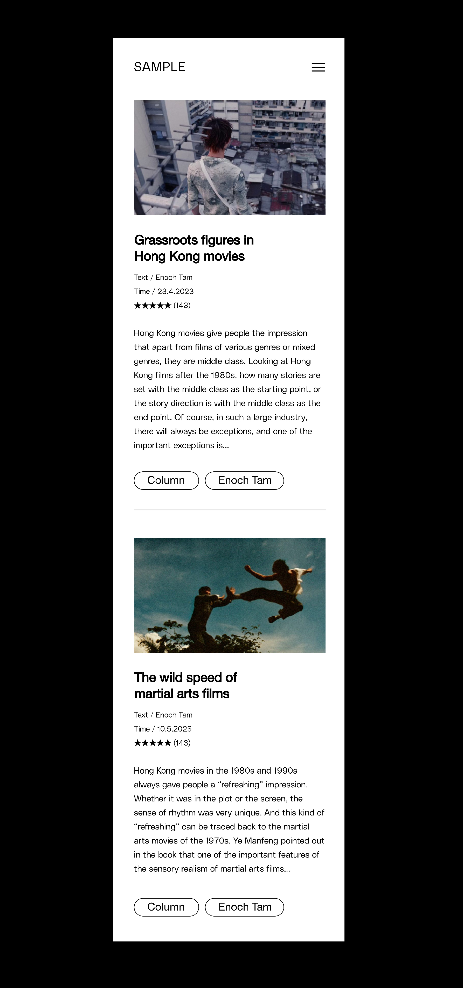
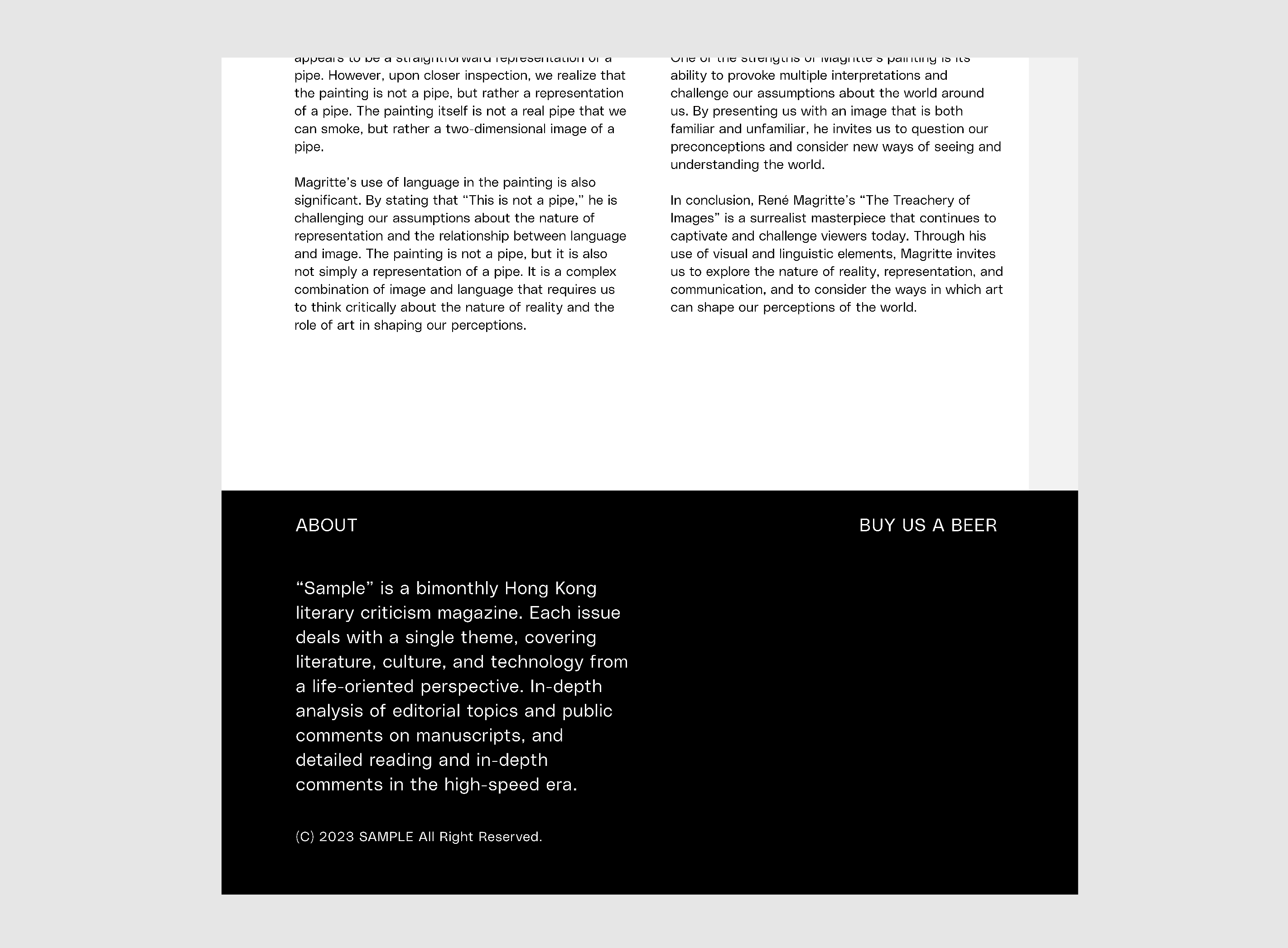
for the website design, I kept it as simple as possible, when visiting the website the users can immediately read the article, and then only one click to shift to check the other article to reduce the complexity for users.
some widgets’ response on the website is also considered to improve user experience, which lets the visit flow more smoothly and responsible.